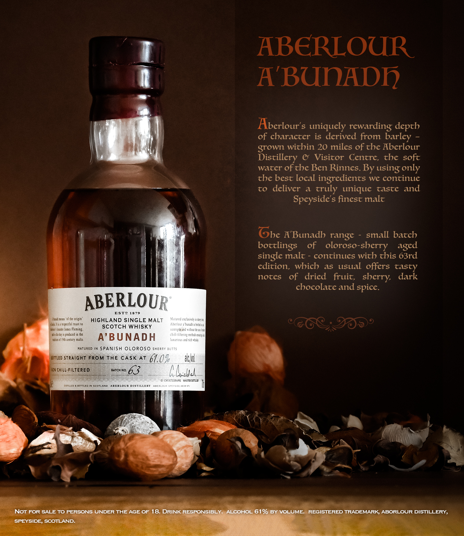
My 1st attempt at creating a mock advertisement based on my own photography and an early exposure to Photoshop. The text comes from the distillery's own website.
Designing an advert for whisky
I recently purchased Adobe Photoshop and as I am a kinesthetic learner figured the best way to develop competence in it was to have an objective - to create something real, to blithely push through the frustrations of unfamiliarity, on the way to producing something I was happy with, based on my own photography.
Back in the early 2000s I did some freelance web development work and was pretty fluent in Fireworks and Flash, which gives me a head start when it comes to vector graphic manipulation.
The end result is this mock advert for whisky, using an image I captured in my home 'studio' (kitchen). The composition, situation and props (a newly purchased bottle and the pot pourri from my lounge) all come together well, I believe, to present an image in keeping with the product and its description.
The gallery containing the source image and similar others is Whisky and Roses